HOME
TOPICS
ABOUT ME
I realize Sir Jony Ive, the knighted Apple executive in charge of this redesign, is considered the best in the business, but anybody can make mistakes.
Starting our fourth decade: Al Fasoldt's reviews and commentaries, continuously online for 30 years
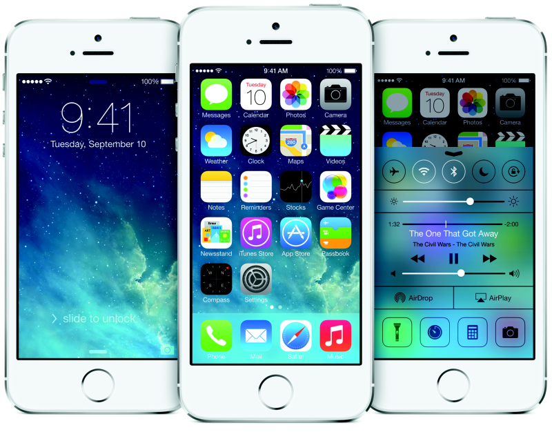
iPhone and iPad get a new operating system, and it's a typographical turkey
October 20, 2013
By Al Fasoldt
Copyright © 2013, Al Fasoldt
Copyright © 2013, The Post-Standard
Without Steve Jobs, Apple is trying out a new look for its i-devices. Steve kept things under control while he was still in charge, but the cat's away -- for good -- and the mice are starting to play.
It's a jarring change. Some of the changes to iOS (the i-device operating system) are in the "hey, it's about time" category, but the new look reminds me of the Bauhaus School, the simplify-everything art movement in Germany between the two world wars.
But the Bauhaus movement is old -- almost a century old, in fact -- and it's long since given way to newer and more exciting ways to design the look of icons and text on a screen. I realize Sir Jony Ive, the knighted Apple executive in charge of this redesign, is considered the best in the business, but anybody can make mistakes. Jony, welcome to the world.
The iPhone and iPad (and the sometimes forgotten iPad Touch, an iPhone of sorts that doesn't make calls) had gorgeous displays until now. The fonts were superb. I'm a newspaper page designer and live in the world of good fonts; Apple's were great examples of how to do things right.
Until now, in iOS 7. Characters are slim and hard to see, and, oddly enough, they even lack "character" -- almost a sin in type design. They're so wispy that they're hard to distinguish from across the room. That's bad news for anyone who uses the excellent alarm clock built into iOS.
Of course, Apple lets you change the font to something more readable. Right?
No. Totally, irredeemably wrong. Apple won't let you do what Android's designers do. You can't make changes to the look and feel of iOS. That's a subject for another column, but it's worth remembering.
Apart from the dismal look, the new iOS gets some features common to Android devices, in the if-you-can't-beat-them, better-join-them category. Many of them are inconsequential. (Swiping up to kill off an app? C'mon.) But I'm not as critical of the new features as I am of the awful look, because they're the first sign that Apple finally knows why it's losing market share to Android. Maybe in the next iteration Apple will notice that Android phones and tablets have even more features that it's leaving out.
iOS 7 is a free upgrade. Your iPhone, iPad or iPad Touch will alert you, if it hasn't already, that you have an upgrade waiting.